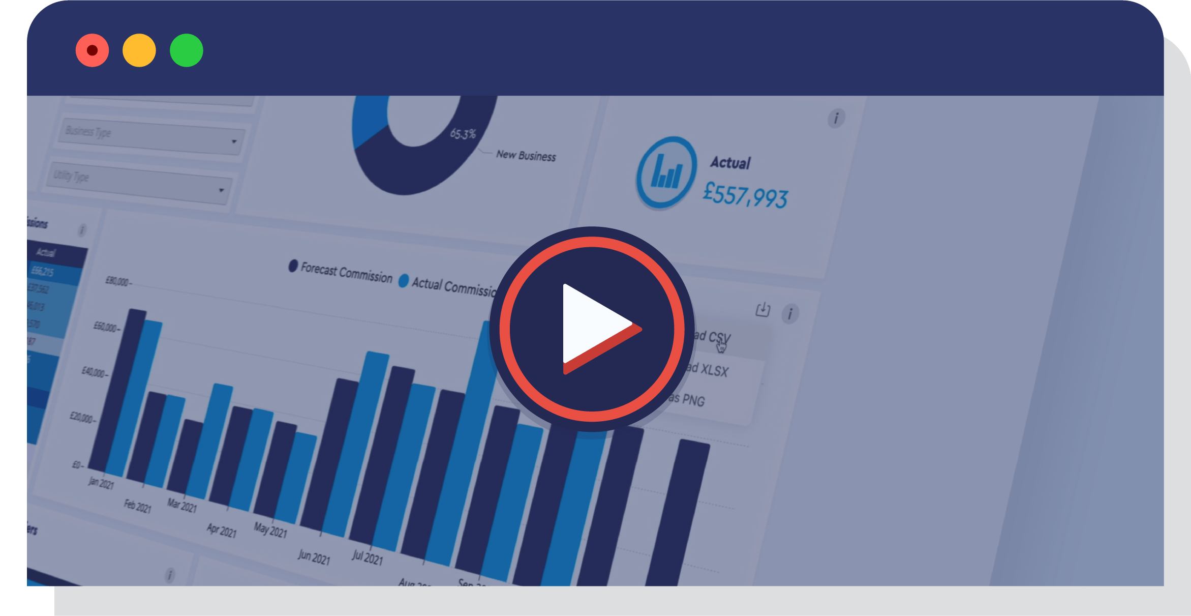
Presenting a brand new UtilityClick series of video shorts that we call: Reporting Drilldown.
In this prologue to our Reporting Drilldown series, we introduce you to our Dashboards and take a look at what makes them the best of the best:
Beautiful – We’ve worked really hard to make sure that our reports look great. It’s easier not to get bored with report after report if they look fantastic! Industry Leading – No system out there comes close to how our Dashboards can present data in a clean, simple and useful way. Intuitive – Each chart is interactive, helping you to drilldown to the dataset you require. Configurable – Need your own report? Need changes made to your reports based on specific requirements? No problem. Our reports can be amended on the fly to support your business. Simple – Reports are useless if they’re overly complicated. Whilst our 10 out the box reports are comprehensive, they have been built based on customer feedback to ensure they only present the most useful information.
Keep an eye on our website and social channels over the coming weeks for new “Reporting Drilldown” video shorts, as we’ll look deeper at: Sales Opportunities, Employee Performance, Customer Rankings, Managing Your Financials, and much more...
Can't wait? See our Dashboards in action today...
Further reporting reading...
BILL VAL 3.0
Say goodbye to clunky workflows and hello to a new era of intelligent automation. BILL…
Energy Reporting: 03 Carbon Reporting
Energy brokers, you know it's more important than ever to provide additional value to…


