 Switch to US
Precursor: In 2020 we wrote an article titled “Could A CRM Give You Pleasure?” which proved rather popular. We’ve also spent much of last year improving the UX of our software.
But WHY?
Does any of it really matter? Thankfully there have been numerous studies to answer this very question…
For example, in 2005 a group called The Design Council studied portfolios of companies that traded on the FTSE over the past 10 years. What they discovered was that the companies that put an emphasis on design outperformed the FTSE 100 index by 200%*.
More recently, in 2015 the National Endowment for the US Arts released a study that concluded that small businesses saw a 17.5% increase in average sales on improved goods and services when they invested in design**.
https://www.arts.gov/sites/default/files/NEAIndustrialDesignManufacturing-4.28.2017-rev.pdf
As Homer Simpson once said:
"Facts are meaningless. You could use facts to prove anything that's even remotely true!"
So let’s drill down into
Five reasons why design doesn't just matter for the energy sector, it's imperative:


Good design has the power to simplify the complex processes that you find in the energy sector.
If you were to create a piece of software that fulfilled every part of your job – that system would be complex to a point of chaos but good design can simplify it all into manageable chunks. If done right, the design can act as a translator, simplifying the complex language of your processes.

Good design can affect users emotions and can actually make your team happier.
It may seem trivial to focus on emotion when talking about software but companies are realising more and more that it’s possible to evoke a positive response from simple interactions, like a hover effect or a popup animation.
Firms such as Apple have built billion-dollar products around how good it can make a user feel, where everything is carefully crafted to give the user a positive experience.
A CRM is much like your phone. You’ll likely spend more time looking at it than you will your own family, so it’s only right that it should also invoke positivity for the user.

Good design can make your team more efficient
As humans, we have an inbuilt nature to take the perceived quickest route to a solution, especially if we’re unsure of the path ahead. When performing a complicated task, good design can provide useful tools precisely where and when they’re needed along a workflow. For instance, having an important button appear more prominent than other page elements can help guide users eyes on where they should go next.

Good design can help highlight your wins and losses
Presenting your data is all well and good but if its meaning is not clear, then it’s likely to be overlooked. This is even more apparent when reporting within the energy sector. Good design can help declutter and present important, actionable information whilst giving the option to drill down to the data that matters. Users can then focus clearly on the presented facts and adapt swiftly to the cause of their wins.

Good design can provide assurances of a high level of service.
If we hold two products side-by-side, we’ll invariably focus on the better-looking of the two. This is where the good design looks to assure us that “If they’ve spent this much effort perfecting how it looks, then the way it works must also be as equally well thought out”.
Although we know that doesn’t always hold true, it’s inbuilt within us and we still can’t help but use it as a base for commercial decisions. When providing completely re-brandable software like ours, it’s even more imperative that when your customers are using it, the way it looks matches the high level of service that you provide.
Summing It All Up
Investing in good design is superficial by its nature but the results will bleed into numerous positive areas, far and beyond aesthetics. Here at UtilityClick we care enormously about the software experiences our users will have, that’s why we invest so much in a design to convey that. We don’t believe any equivalent system can attest to that.
If you’d like to see how we’ve taken these 5 points above (and a few more) to transform our software, get in touch for a demo:
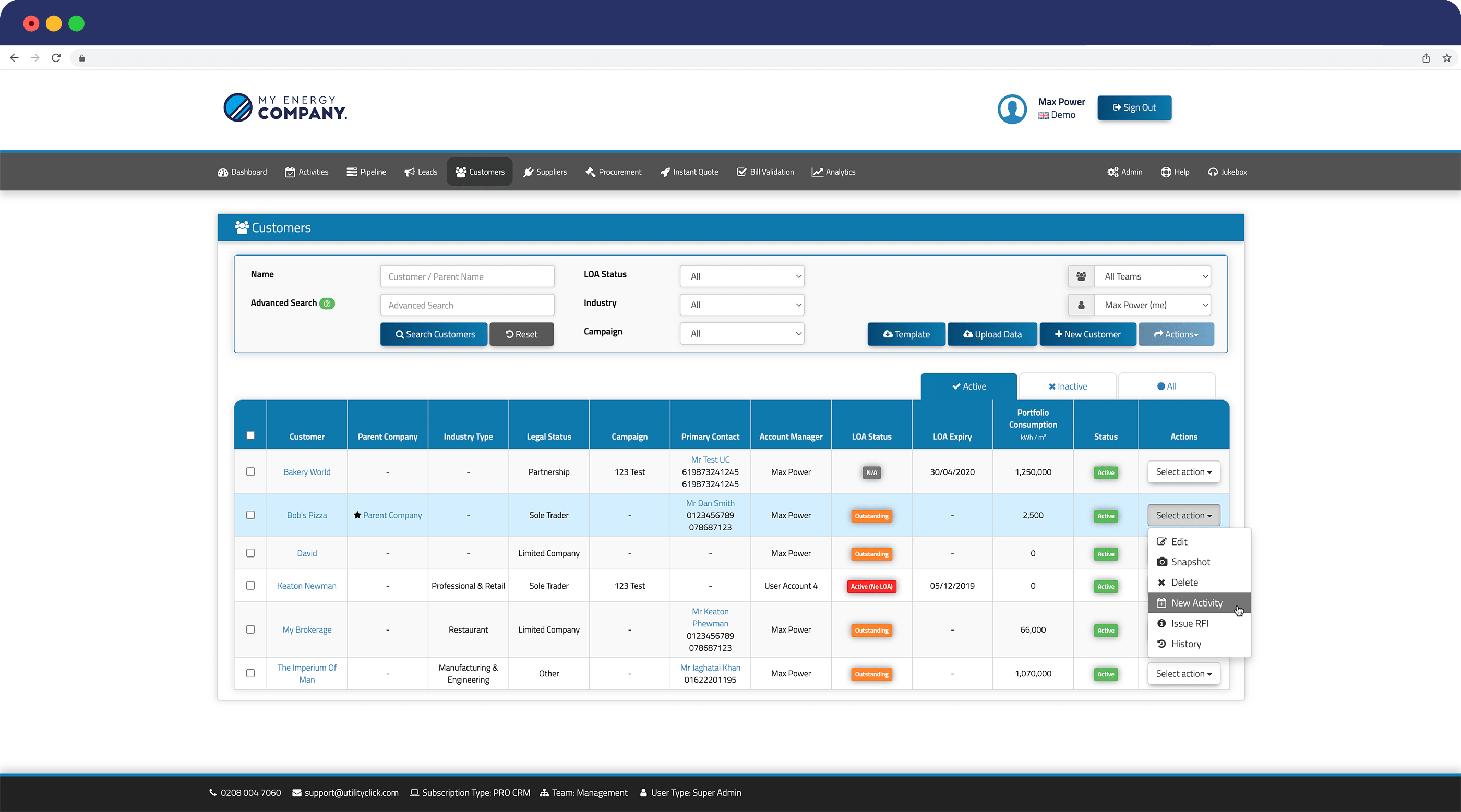
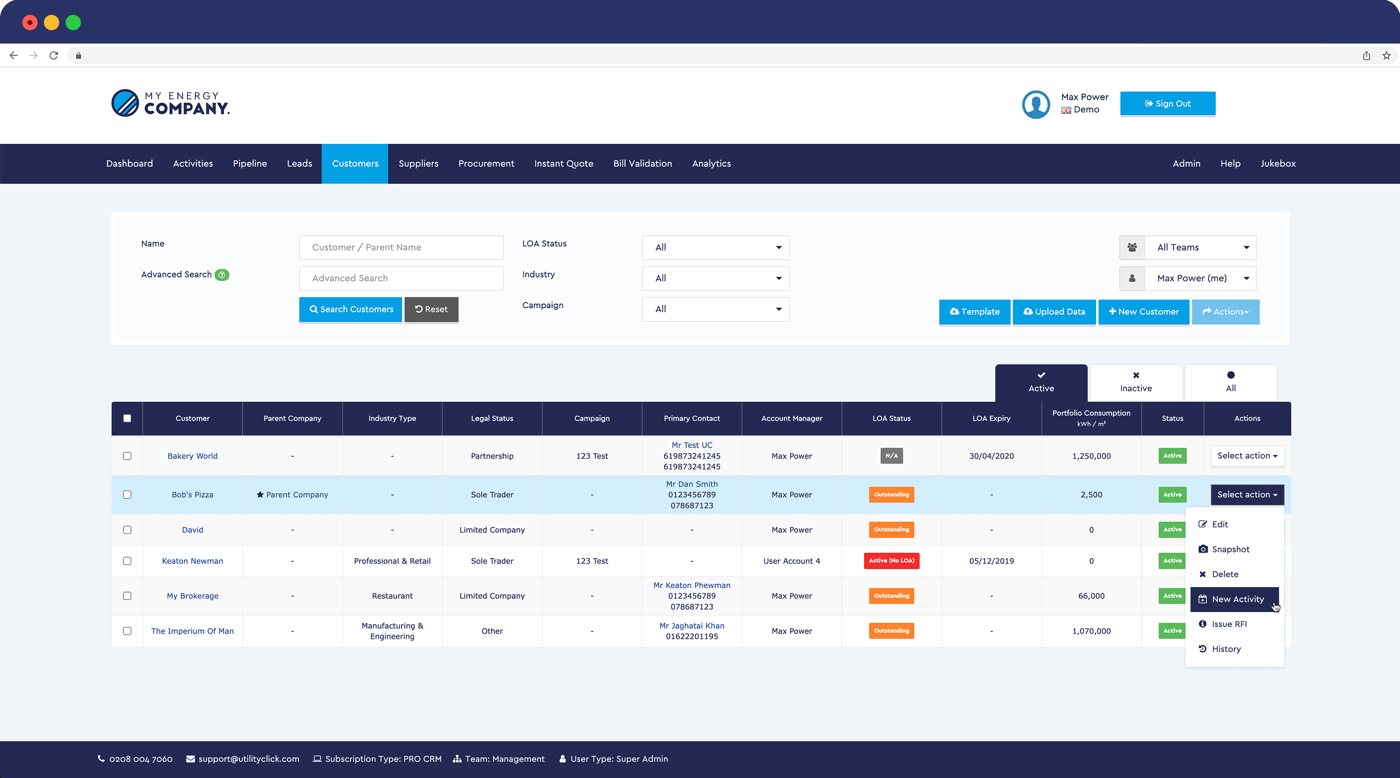
An interactive side-by-side of old Vs. new for our PRO CRM product.